Tutorial
The module contains one class jcclass.jc which works with MSLP netcdf files. Import the respective module as:
from jcclass import jc
We will use a sample dataset from ERA5 Reanalysis with daily mean MSLP (download here).
Note
A higuer resolution dataset (0.25 x 0.25º) on hourly data is available also here
Computing the CTS
filename = 'era5_daily_lowres.nc'
cts_27 = jc(filename).classification()
Reducing to 11 CTs
Reducing the original 27 CTs to eleven can be done by running:
cts_11 = jc.eleven_cts(cts_27)
The reduced number of circulation types can be saved as a netcdf
cts_11.to_netcdf('output.nc')
Plotting the CTs
There are three options to visualise the circulation types on a map using cartopy.
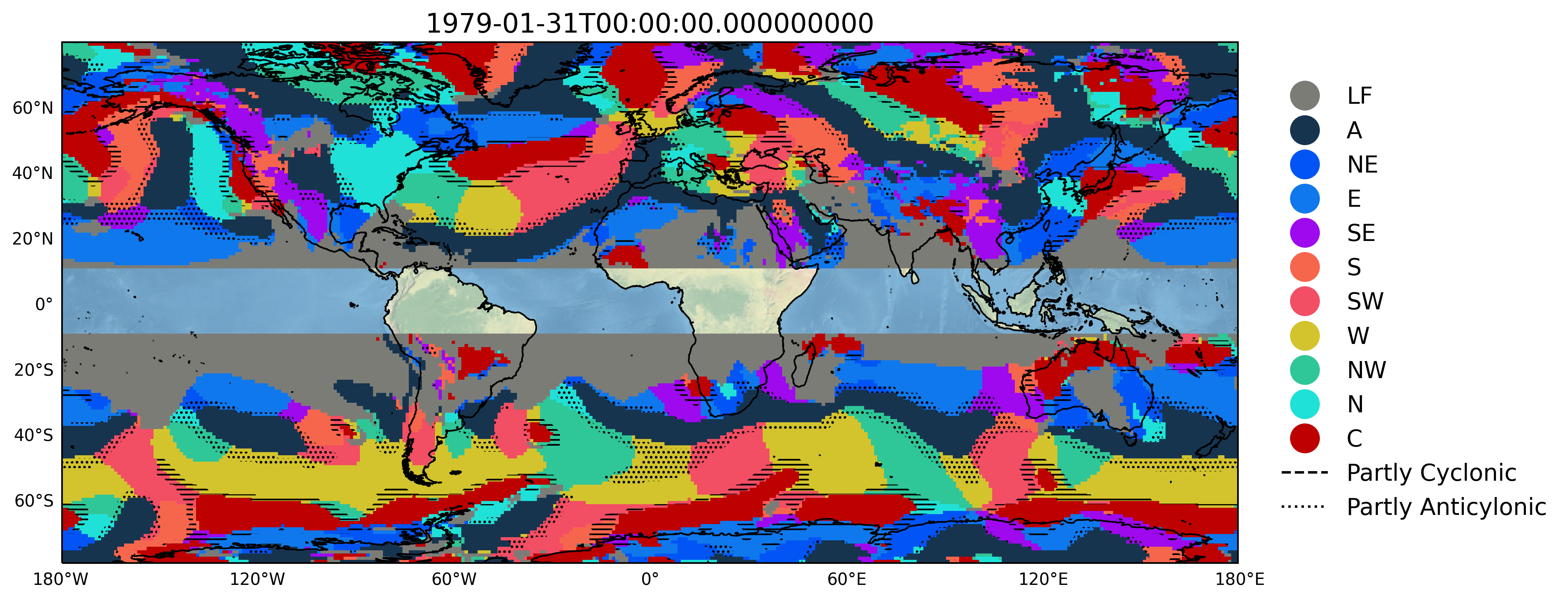
Only CTs
import xarray as xr #to select an specifc date
date = cts_27.time[0] #selecting the date
cts = cts_27.sel( time = date ) #Extracting only a 2D DataArray ['lat', 'lon']
fig = jc.plot_cts(cts, *args)
cts : xarray.DataArray, a 2D [‘lat’,’lon’] xarray.DataArray of the 27 CTs.
** args* : int, optional
lon_west : westernmost longitude (-180 to 180).
lon_east : easternmost longitude value (-180 to 180).
lat_south: southernmost latitude value (-90 to 90).
lat_north: northernmost latitude value (-90 to 90).
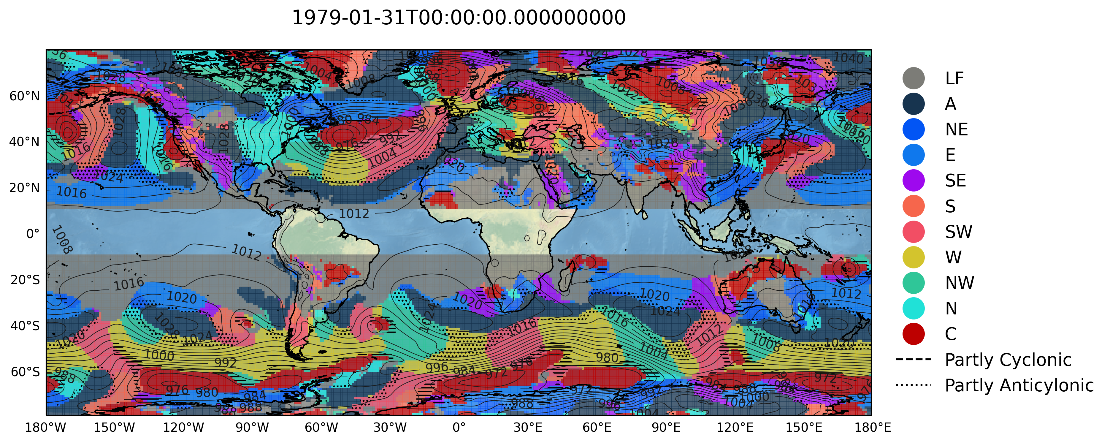
CTs + isobars
mslp = xr.open_dataset(filename).sel(time = date) #extracting MSLP on the same day as the CTs

fig = jc.plot_cts_mslp(cts, mslp, *args)
mslp : xarray.Dataset, a 2D [‘lat’,’lon’] xarray.Dataset of the MSLP data.
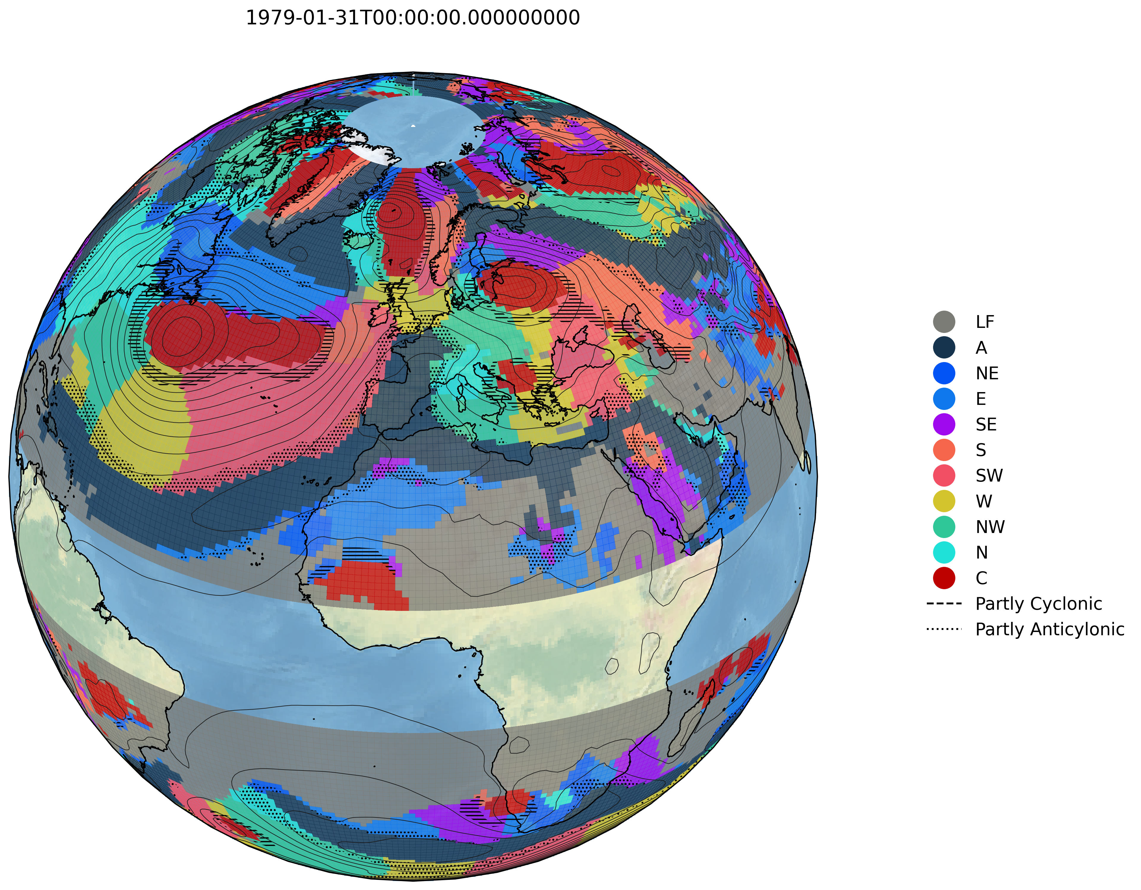
CTs on a sphere
This plots the circulation types and the MSLP contour lines using the Nearside perspective of cartopy.
fig = jc.plot_cts_globe(cts, mslp, *argsglobe)
** argsglobe* : int, optional
lat_central : central latitude value (-90 to 90). Default 30ºN.
lon_central : central longitude value (-180 to 180). Default 0ºE.